Note: This is a cross post by courtesy of the MZES Social Science Data Lab, Mannheim.
Telling stories with data is one of the most important things to do for almost everyone working with data analyses. Why? Because its goal is reaching the audience one wants to reach. If one succeeds therein – be it, for example, average news consumers or academics in a specific field –, the underlying data analysis will more probably have a lasting impact. A good story drags the audience into your analysis.
This is where data-driven journalism comes into play - a field in journalism that emerged a few years ago with advancing technological developments (such as easier web-scraping and advanced visualisation, programming, and the ability to process large amounts of data more easily, etc.) being introduced to newsrooms and journalistic curricula. Examples range from simple yet challenging data analysis with a line chart to visually and analytically more advanced stories. Even methods of machine learning have recently been used in newsrooms for investigative research. By outlining its background and principles, this post also shows how closely communicating scientific results is related to data journalism and what researchers can take away from it to deliver even more compelling insights.
In this Methods Bites Tutorial, I want to offer a recap of my workshop “Telling Stories with Data - Insights into Data Journalism” in the MZES Social Science Data Lab during Spring 2021. It focuses on the important steps to tell a thorough story based on data analyses – and how scientists and data journalists can learn from each other.
The original workshop materials, including slides, are available from the Lab’s GitHub. A live recording of the workshop is available on the Lab’s YouTube Channel.
Where do data stories originate?
There are two basic ways of finding a data-driven story in the first place: starting with the data or starting with the story. In general, it is desirable to have a story (and maybe even a potential headline) in mind when starting your research. This way, you most probably already have some kind of structure (or, say, hypotheses) that you can follow. Thus, in my opinion, it’s a more journalistic way to work, because you select your hypotheses already based on your perception of the key concept: relevance. Only then will you proceed to data research or collection. But that is of course not always how things work. Sometimes, you just stumble upon a new data set and you don’t know yet if there is a story inside. Maybe also some informant sends you a lot of unstructured data and you have to explore it yourself. In any case, in this scenario you start by exploring in a trial-and-error way, attempting to find a story while thinking of a relevant headline. Here, as well as generally, it is important to keep in mind that any correlation you may find does not mean there is also causation.
What is a good data-driven story?
But what is a good story after all? In short, you have to bring the relevance of your analysis to the surface. By relevance I mean some sort of topic that is important for society or at least for a huge portion of your audience (here, it helps to have a good understanding of who your audience is). Relevance, especially in terms of data journalism, also means trying to question common assumptions that have not been investigated using data – a common relevance criterion for scientists as well. Your audience will read and process your (data-driven) story mainly if they understand the way it affects their personal life. In this context, it is always a good idea to actively underline this aspect in the headline and also during the first paragraph(s) of your text. In a data context, relevance often involves breaking down your data to a local level so readers find themselves, their relatives, or their environment in the data. This way, you make sure to definitely gain their attention. Let me give you an example: Some years ago, I wanted to know how many children up to three years go to daycare. Germany had enacted a law guaranteeing this for all children of that age, but from anecdotal evidence, it was evident that daycare institutions struggled to meet this goal - a huge problem for young families. I collected data on a very local level, thus covering a quite pressing societal problem, showcasing how the government failed its own goals. Additionally, I was enabling the readers to find information on their town or region in the data to tell whether they’re doing better or worse than others.
Summing up, this means in order to tell a good data-driven story:
- Think of a headline (i.e., a precise key message) while doing your project so you keep focusing on what is important.
- Think of who your audience is and tell them straight away why your story is relevant in their daily lives.
- Discuss your topic with colleagues to make sure your storyline is consistent.
- Know the questions you want to ask the data and know what not to find in the data.
- In data exploration terms: Transform and merge with other data, count or total some variables of interest, do comparisons and show change over time, etc.
Challenges for data-driven journalism
In their day-to-day work, data journalists face some challenges. To keep things short, I want to set aside problems involving badly formatted data and other technological challenges such as poorly designed or undocumented APIs. But there are some general things you have to cope with during research for a news piece.
- First, to ensure the quality of the conclusions you draw from your analysis, you have to make sure you know the data generating process of the data set you are working with. Relevant questions to ask are for instance who collected the data and how? Do the data allow for the conclusions you draw (think of the variables’ operationalisation)? Is your data representative (e.g., has it been collected using randomization)? If you haven’t thought about this enough, critical readers will inevitably challenge your story.
- Second, always double-check for potentially erroneous data. To do so, also talk to colleagues if possible. Do frequent plausibility checks. If your analysis involves code and you have enough time, set it aside for a day and come back to it later. Even better, if you have colleagues that can code, show and explain your coding. Alternatively, explain a non-coding colleague what you did step-by-step to identify mistakes.
- Third, do not forget classic journalistic research with data sources that are available for your specific topic. Always think about whether there are better alternatives to your current database. Explain in your text why this is the best source available.
- Fourth, if you’re writing your news piece, don’t over-emphasise technological or methodological aspects, especially when you write for a general audience. Readers often don’t have a lot of time and what’s important is that they understand your key message or conclusion (i.e., the reason your headline dragged them into reading). The challenge here is to don’t become inaccurate or over-interpret your results at the same time. Oftentimes, there is little time in newsrooms to proof-read for this aspect, but it is inherently important for basic journalistic work.
Some thoughts on data visualisation
Data visualisation is a whole chapter itself, and there are tons of excellent tutorials out there on how to make reader-friendly graphics, which is why I cannot possibly get too much into detail here (for every-day graphics in newsrooms think of the phantastic blog posts of Lisa Charlotte Muth of Datawrapper or the homepage of Information is Beautiful, for general visualization think of the books and work of Alberto Cairo). However, I’d like to share some general thoughts, because they are – besides a compelling key message – a crucial ingredient for your story:
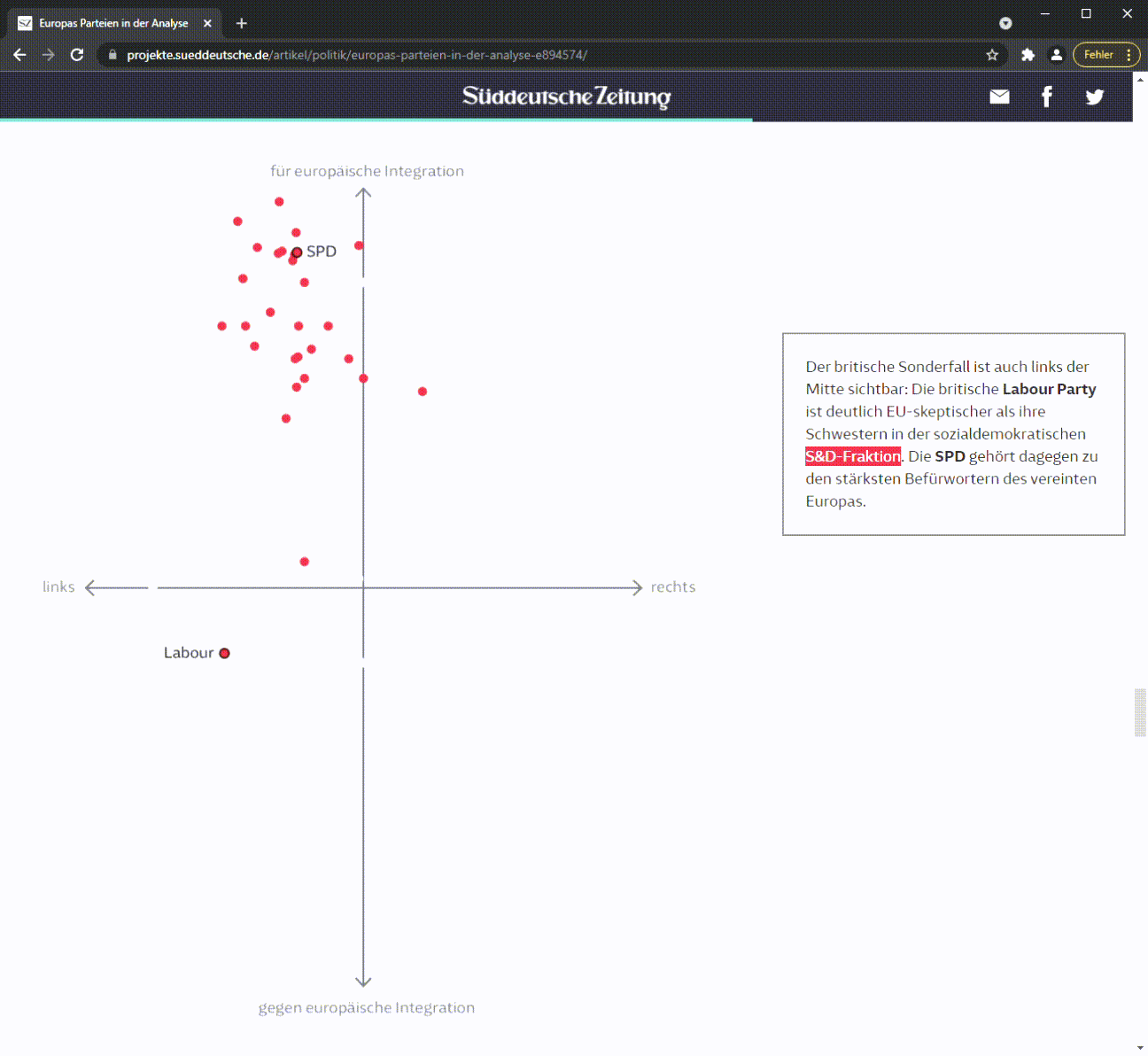
-Try to visualise your data if possible, many people understand information way better if it is accompanied by a visualisation. Also, people tend to stay longer with your article if they find graphics there. One example from my work is this explainer on how the parties in the European Parliament are grouped ideologically and by fraction (and how these two things sometimes do not overlap). Data visualisations, especially interactive ones, must not be too full of information. It is good practice to guide your reader through the graph – just as me and some colleagues at Süddeutsche Zeitung did in this visual piece on the political factions in the European Parliament. Using scrollytelling, some explanatory text and visual highlighting, we make sure the reader understands the most important message.
- User experience is of utmost importance. If your readers need too much time or work to understand a visualisation, try to be more concise.
- Mobile-first! Most readers consume your content on a mobile phone. So make sure that they can consume your graphics on these devices effortlessly.
- However: The story guides the visualisation. Don’t make graphs for the sake of it. If they create confusion, don’t visualise (maybe try a table instead). Better have no graphics than bad ones.
- Think about what the reader needs to know to understand your graph. This depends on your audience and their needs.
- If possible, go local. Make an interactive visualisation where people can find themselves (i.e., their town, area, neighbourhood, etc.).
- If you have decided to do data visualisations, rather include more charts in your text instead of one chart with too much information in it! Put differently: If there is too much information in one chart, try to split the information into different graphs. For example, many readers already fail to interpret a two-dimensional scatter plot immediately. If you have to spend more than two or three sentences to explain the graph, make it easier instead. There is, however, no general rule on how many charts a text can take – it largely depends on the length, type and topic of the text. The coverage of the Covid-19 pandemic yields a great example across the media. Here, a complex topic has to be broken down – e.g., by using small multiple graphs when going local.
Scientists and data journalism
Summing up, I believe scientists can learn a lot from data journalism. They, too, want their results to be recognised by the general public. By - as far as possible - adhering to the principles laid down in this blog post, I believe scientists can increase their audience to some extent by thinking about its needs while writing up results, visualising, and finding a compelling story. At the same time, data journalists can learn from the scientific way of working, namely: explaining the boundaries of data analysis and communicating them. Another important thing is communicating uncertainty (i.e., things like confidence intervals and the concept of simulations/scenarios versus an actual prediction, already somehow common in election coverage and Covid-19 coverage). Sometimes, data journalistic projects reach scientific spheres. This is when concepts like reproducibility and transparency come into play for data journalists as well. And at this point, it helps to work together with scientists of the field of concern.
Further readings