The coronavirus is halting public live all over the world. So, many of the patterns of data regarding flight departures or traffic that we see these days are, objectively speaking, unsurprising. As of now, most of us are coping well with the situation and stay at home, as is recommended. As a result, the public sphere is emptying. Right now, this is a strategy that I support. However, it is hitting the economy harder than one might think. This is especially true for the small shops in the city centres. Most of them have been forced to close.
So, looking at pedestrian data can show us two things, anyway. 1) They show us how persistently people are keeping away from German city centres. And 2) they show us a rough estimate of how bad the situation is for the shops in the city centres. Maybe two years ago, I learned from a colleague that there is this new homepage where one could get pedestrian data from German cities, where they measure the amount of pedestrians on central German shopping streets using lasers. The site is called hystreet.com and its data can be downloaded freely after creating an account. Since the spread of Covid-19, some journalists have had a look at this kind of data already for the big German cities. In this tiny, quick hands-on analysis, I focus on the federal state of Baden-Württemberg, which is where I live.
First, we need a couple of packages.
Second, we need to do a bit of data wrangling. I start with loading two datasets that I downloaded from hystreet.com. They contain data for the largest shopping street in Stuttgart, the Königstraße. The dataset from 2020 contains data from January 6th until March 26th. I have a second one from 2019 that contains data from March 1st to March 31st.
# Read the csv file from hystreet.com

path <- paste0(here::here(),
              "/_posts/2021-06-27-covid-19-see-german-shopping-streets-emptying/")

df1 <- read.csv(here::here(path, "stuttgart-königstraße-mitte.csv"),
                sep = ";",
                stringsAsFactors = FALSE)
df2 <- read.csv(here::here(path, "stuttgart-königstraße-mitte-2019.csv"),
                sep = ";",
                stringsAsFactors = FALSE)

rm(path)
# Some data preparation
df1 <- df1 %>% mutate(time_of_measurement = as.POSIXct(time_of_measurement),
               date = lubridate::as_date(time_of_measurement),
               time = lubridate::ceiling_date(time_of_measurement, unit = "hours"))

df2 <- df2 %>% mutate(time_of_measurement = as.POSIXct(time_of_measurement),
               date = lubridate::as_date(time_of_measurement),
               time = lubridate::ceiling_date(time_of_measurement, unit = "hours"))
After doing so, the data set looks like this:
glimpse(df1)
Rows: 30,934
Columns: 7
$ location            <chr> "Königstraße (Mitte), Stuttgart", "König…
$ time_of_measurement <dttm> 2020-01-06 00:04:21, 2020-01-06 00:09:5…
$ counted_pedestrians <int> 31, 24, 34, 30, 32, 23, 23, 12, 27, 27, …
$ type                <chr> "regular", "regular", "regular", "regula…
$ incidents           <lgl> NA, NA, NA, NA, NA, NA, NA, NA, NA, NA, …
$ date                <date> 2020-01-06, 2020-01-06, 2020-01-06, 202…
$ time <dttm> 2020-01-06 01:00:00, 2020-01-06 01:00:0…head(df1, n = 5)
location time_of_measurement
1 Königstraße (Mitte), Stuttgart 2020-01-06 00:04:21
2 Königstraße (Mitte), Stuttgart 2020-01-06 00:09:56
3 Königstraße (Mitte), Stuttgart 2020-01-06 00:14:15
4 Königstraße (Mitte), Stuttgart 2020-01-06 00:19:58
5 Königstraße (Mitte), Stuttgart 2020-01-06 00:24:37
counted_pedestrians type incidents date
1 31 regular NA 2020-01-06
2 24 regular NA 2020-01-06
3 34 regular NA 2020-01-06
4 30 regular NA 2020-01-06
5 32 regular NA 2020-01-06
time
1 2020-01-06 01:00:00
2 2020-01-06 01:00:00
3 2020-01-06 01:00:00
4 2020-01-06 01:00:00
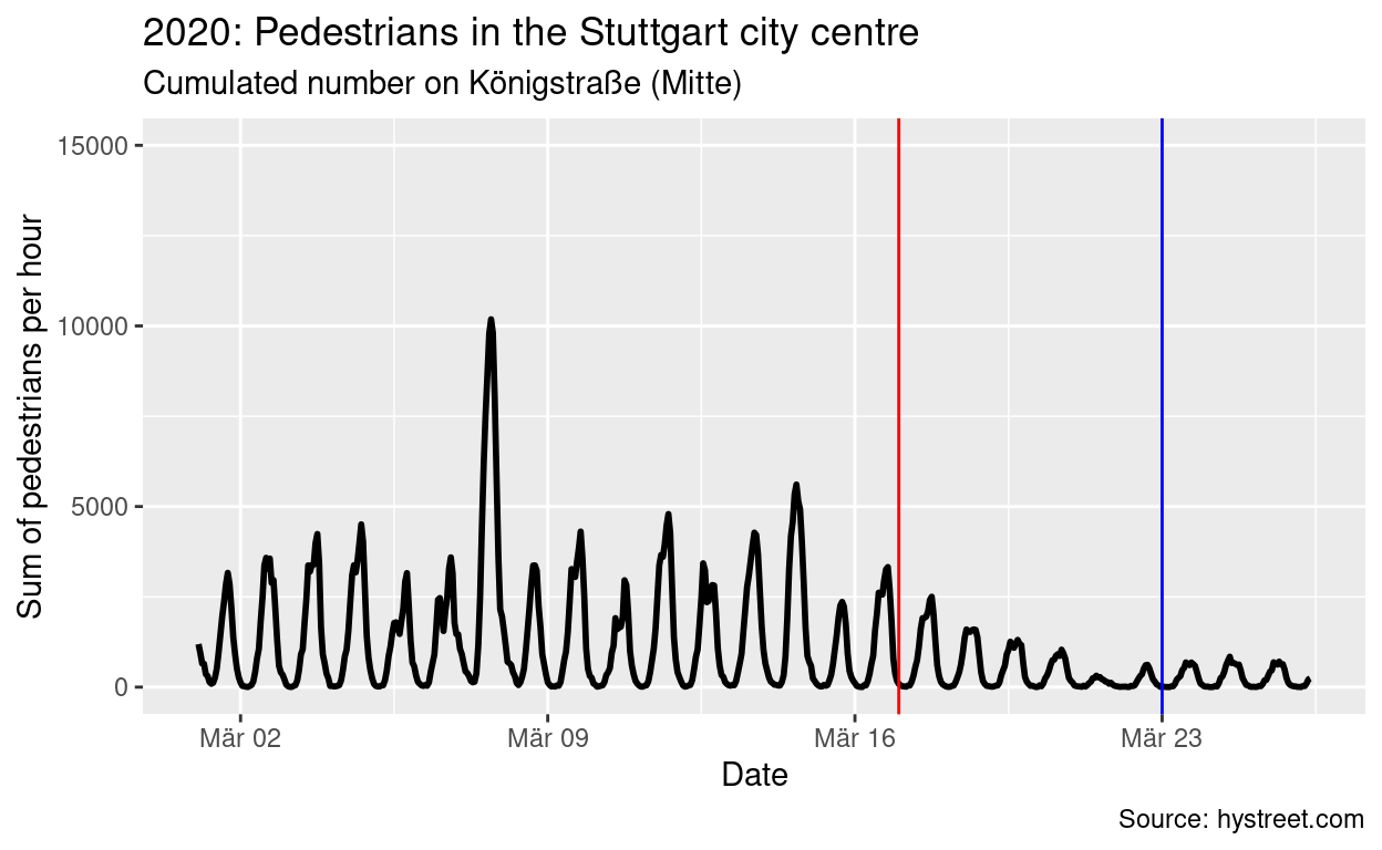
5 2020-01-06 01:00:00The first thing I am interested in is the long-term perspective. First restrictions on public life have been announced by the federal government on March 17th (red line in the figure below), further restrictions followed on March 23rd (blue line in the figure below). The second figure shows a comparable time span from 2019. This way, we can (if only slightly) control for seasonal effects, too. That second time span of 2019 serves as a benchmark for how the number of pedestrians would have developed if the coronavirus restrictions would not have hit. I scaled the y axis equally to a maximum of 15,000 pedestrians per hour to spot the difference more easily.
df1 %>% filter(date >= "2020-03-01") %>% group_by(time) %>%
  summarise(n = sum(counted_pedestrians)) %>%
 ggplot(aes(x = time, y = n)) +
  geom_line(size = 1) +
  geom_vline(xintercept = as.POSIXct("2020-03-17"), color = "red") +
  geom_vline(xintercept = as.POSIXct("2020-03-23"), color = "blue") +
  ggtitle("2020: Pedestrians in the Stuttgart city centre",
          subtitle = "Cumulated number on Königstraße (Mitte)") +
  labs(caption = "Source: hystreet.com") +
  xlab("Date") +
  ylab("Sum of pedestrians per hour") +
  ylim(0, 15000)
df2 %>% filter(date <= "2019-03-26") %>% group_by(time) %>%
  summarise(n = sum(counted_pedestrians)) %>%
 ggplot(aes(x = time, y = n)) +
  geom_line(size = 1) +
  ggtitle("2019: Pedestrians in the Stuttgart city centre",
          subtitle = "Cumulated number on Königstraße (Mitte)") +
  labs(caption = "Source: hystreet.com") +
  xlab("Date") +
  ylab("Sum of pedestrians per hour") +
  ylim(0, 15000)
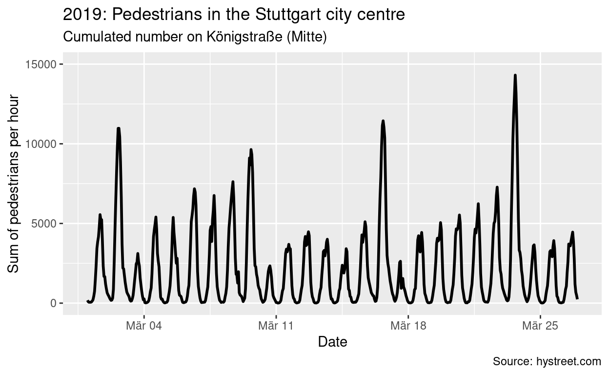
You can see that even before the restrictions were passed by the federal government, numbers of pedestrians were already in decline and are now almost absent. In raw numbers, this is (again, compared to 2019):
# A tibble: 7 x 2
  date           n
  <date>     <int>
1 2020-03-20  9908
2 2020-03-21  2884
3 2020-03-22  4350
4 2020-03-23  6628
5 2020-03-24  7564
6 2020-03-25  6692
7 2020-03-26 656# A tibble: 7 x 2
date n
<date> <int>
1 2019-03-25 34788
2 2019-03-26 40252
3 2019-03-27 44181
4 2019-03-28 50518
5 2019-03-29 69944
6 2019-03-30 148604
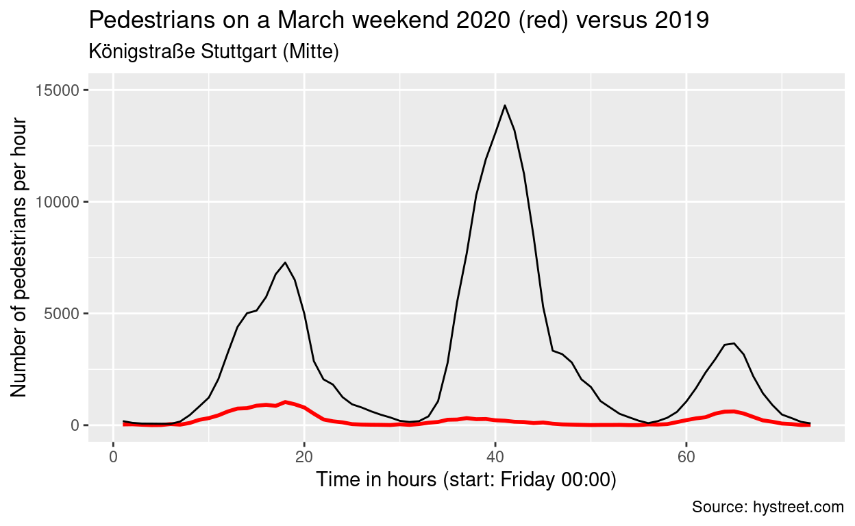
7 2019-03-31 35709As a last analysis, I want to focus on the weekends, unsurprisingly the days with most pedestrians in the city centres. This last figure basically speaks for itself. I compare two weekends end of March, 2020 versus 2019. It is evident 1) how many people stayed home (as long as they did not meet up in any other place instead) and 2) how many potential customers the city centre shops are missing every day (and especially Saturday) that they have to remain closed.
time1 <- seq.POSIXt(as.POSIXct("2020-03-20 00:00:00"),
                    as.POSIXct("2020-03-23 00:00:00"), by = "hour")

time2 <- seq.POSIXt(as.POSIXct("2019-03-22 00:00:00"),
                    as.POSIXct("2019-03-25 00:00:00"), by = "hour")

plot1 <- df1 %>%
   filter(time %in% time1) %>%
   group_by(time) %>%
   summarise(n = sum(counted_pedestrians)) %>%
   mutate(hour = lubridate::hour(time),
          date = lubridate::as_date(time),
          day = lubridate::day(time),
          id = 1:length(n))

plot2 <- df2 %>%
    filter(time %in% time2) %>%
    group_by(time) %>%
    summarise(n = sum(counted_pedestrians)) %>%
    mutate(hour = lubridate::hour(time),
          date = lubridate::as_date(time),
          day = lubridate::day(time),
          id = 1:length(n))

 plot1 %>% ggplot(aes(x = id, y = n)) + geom_line(size = 1, color = "red") +
   ggtitle("Pedestrians on a March weekend 2020 (red) versus 2019",
           subtitle = "Königstraße Stuttgart (Mitte)") +
   ylim(0, 15000)+
   ylab("Number of pedestrians per hour") +
   xlab("Time in hours (start: Friday 00:00)") +
   geom_line(data = plot2) +
   labs(caption = "Source: hystreet.com")
This is not the most insightful analysis since the figures that we can see were to expected given the current Covid-19 crisis. However, I think by using data from hystreet.com we can make a bit more evident how many people actually stayed away from the centres. I replicated the analysis for a couple of other cities of south west Germany – unsurprisingly, again, they all look pretty similar. If you continued up until this very end: Stay healthy – and please stay home (for now).